
The girl in the café looked perfect from a distance. Her eyebrows were shaped well and her eyeliner was neat & her lips were shiny. When she moved closer to the window something seemed wrong. Her cheeks had a thick stripe of color right beside her nose like she had just run up several flights of stairs. The makeup quality was fine but it was applied in the wrong place. You have probably noticed this before while looking at social media or passing people on the street. Sometimes a face has blush that sits too close to the center and it makes the features look smaller & compressed. It looks fine when you check it in your bathroom mirror but once you see it on camera or in natural light it throws off the entire balance of the face. That small difference of about two centimeters separates a fresh healthy look from a crowded appearance. This is not just about style preferences. It comes down to basic geometry.
How Blush Placed Too Close to the Nose Can Disrupt Facial Harmony
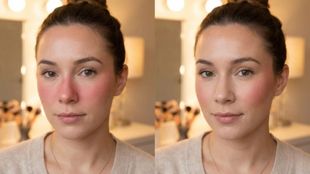
When blush sits too close to the nose it can make your face look narrower and more strained. The middle of your face becomes the focal point while everything else like your eyes and cheekbones gets pushed to the background. Rather than lifting your features the color drags them inward. The outer parts of your face seem to disappear. Blush near the nostrils can also highlight any redness around your nose and make your skin look tired instead of fresh. From far away this placement can look puffy or crowded instead of soft and romantic. What should add dimension ends up flattening everything. Look at selfies taken under harsh office lights and you notice it right away. The person looks like themselves but something feels off. Their nose seems more prominent. The center of their face looks busy. Their outer cheeks appear strangely pale. In photos blush placed near the nose tends to blend with any natural redness around the nostrils. Your phone camera makes it worse because it sharpens contrast and shadows so the blush near your nose becomes a solid block of color instead of a gentle glow. Some makeup artists who work in television mention a danger zone around the nose where too much color makes the face look smaller and more exhausted especially under studio lights. That explains why red carpet blush is always placed higher & further out. The reason is straightforward. Your face is not a flat surface but a mix of vertical and horizontal lines. Blush affects how those lines appear. When color is placed very close to the nose your vertical line from forehead to chin looks shorter and more compressed.

Strategic Blush Placement That Enhances Features Instead of Compressing Them
Start with a basic reference point by drawing an imaginary vertical line down from the center of your eye. This marks your inner boundary. Your blush should not cross this line toward your nose. Put your brush on the part of your cheek that naturally curves out when you make a slight smile. You don’t need a big grin but just a small lift of your mouth. Apply your color there and then blend it outward toward the top of your ear in a soft comma shape. Apply thin layers because it is easier to add more color than to remove a mistake that has spread too close to your nose. If you are unsure then leave a small gap of bare skin between the side of your nose and where your blush begins. Many people apply blush too far inward because they follow advice to focus on the apples of the cheeks and they take it too literally. When rushing in the morning the brush lands too close to the nostril and this becomes a habit. On round faces this can make cheeks appear fuller instead of lifted. On angular faces it can make the center of the face look harsh and draw attention away from the cheekbones. On textured skin the color near the nose tends to settle into pores and fine lines. Everyone has experienced catching their reflection later in the day and wondering why they look flushed or tired. Usually the problem is not how much blush you used but where you placed it. A small adjustment outward can improve how you look in photos all day. There is a simple mental checklist to help you keep blush away from your nose while still looking natural:

– Leave at least one finger width of bare skin between your nose and blush.
– Angle your brush slightly upward instead of straight across your face.
– Remove excess product from the brush before touching your skin.

– Blend more on the outer edge than the inner edge.
– Step back from the mirror and look at your face from arm’s length away.
Let’s be honest because nobody spends ten minutes blending blush every single day. That is why simple visual guidelines like the center-of-eye line & the one-finger gap are more useful than complicated contour instructions. They work whether you are using an inexpensive cream stick or a luxury compact & whether you are half asleep before work.
Creating Personal Facial Balance Beyond Social Media Makeup Trends
There is no single correct way to place blush because it depends on the effect you want to create. Moving blush slightly toward the nose can give a cute & youthful appearance on certain faces like a natural cold-weather flush. However if you go too far with this placement it stops looking intentional and starts looking unbalanced. Every face is different and everyone has their own preference for how much color they want to show. Some people enjoy a bold central blush that looks playful and inspired by Korean beauty trends. Others like just a hint of color placed high on the cheekbone that works almost like a subtle filter. The key is understanding how each placement affects your overall look and then making deliberate choices instead of just following habits. The next time you put on blush you should try a simple test. Apply blush on one side the way you normally do with the color placed closer to your nose. On the other side place it slightly higher & further out toward your temple. Step back and take a photo in natural daylight so you can compare the two sides properly. Look at which side makes your eyes stand out more. Notice which side allows your nose to blend naturally into your face instead of becoming the main focal point. Think about which side feels more authentic to your personal style rather than copying the last makeup tutorial you watched late at night. Showing these comparison photos to a friend can give you surprising insights. This exercise is not about criticizing your features. It helps you understand how color placement guides where people look first. The more you experiment with different placements the more you realize your face is not something that needs fixing but rather a canvas you can arrange in different ways. Placing blush near your nose is just one small detail in your overall makeup look but it makes a significant impact. Once you understand this principle you can adjust the intensity whenever you want. The goal is not to hide anything but simply to control what feature you want others to notice first.

| Key Focus Area | Updated Guidance | Why It Matters |
|---|---|---|
| Space Near the Nose | Keep a narrow section of bare skin between the nose and blush placement | Avoids a congested center and maintains natural facial balance |
| Blush Positioning Rule | Stop application before reaching the vertical line below the eye’s center | Creates a lifted effect rather than a weighed-down or puffy look |
| Blending Direction | Diffuse color outward and gently upward toward the temples | Visually opens the face, defines cheekbones, and looks flattering on camera |